


It’s no secret that brochures are an essential part of any business’s marketing strategy. After all, they’re a great way to introduce potential customers to your products or services. However, if your brochures aren’t well designed, you could be turning away potential clients without even realizing it.
In this article, we’ll take a look at 7 common brochure design mistakes and how to avoid them. So whether you’re just starting out with brochure design or you’ve been doing it for years, be sure to read on!
1. Using too much text.
One of the biggest mistakes that people make when designing a brochure is cramming it with way more information than it can handle. How do most people react to huge blocks of text? They skim over them, looking for the important bits, and then move on to something else. This means that your precious brochure copy isn’t getting across to readers, and they’re most likely going to forget about you.
The easiest way to avoid this mistake is by using a classic inverted pyramid design. Start with the most important points at the top of your brochure, then proceed to use less important information as you go on. This will ensure that your readers are never overwhelmed, and they’ll get the important information that they came for.
2. Trying to do too much on one page.
Trying to fit everything you want onto one page is a classic mistake that beginners make with brochure design. For example, if you’re trying to jam in your address, phone number, opening hours, and recent press coverage, you’re just going to end up with a confusing mix of all that information.
This is easily solved by using spread design instead of single-page designs. Spreads give you more room to breathe and play around with, which means better-looking brochures overall. You can even make your spreads look interesting by having them split into segments so that it looks like your brochure is made of multiple pieces.
3. Using low-quality images and clipart.
Brochures are a great way to introduce potential customers to your products and services, but if you’re using bad quality images then the effect won’t be as strong as you’d want it to be. How can people trust you if your product images look like they were taken by an amateur photographer on a smartphone?
What many people don’t realize is that this doesn’t mean you need to spend crazy amounts of money buying access to expensive royalty-free photo websites. There are plenty of stock photography websites out there where you can get high-quality images for very little cost, and even for free in some cases.
4. Using cheesy stock images.
Speaking of bad quality images, another thing that you should avoid at all costs is using cheesy, cringe-worthy stock photos in your brochures (and on your website). How can people trust you if they think that you’re trying to be funny when really it’s just embarrassing?
Instead, embrace simplicity! Using nothing but product photos is a breath of fresh air to look at compared to all the other brochures out there with their cheesy clipart and stock images. Sure, your brochure might not stand out as much compared to others in its genre, but you’ll be showing off your products in the best light possible.
5. Using clipart when you should use photos.
Although we just touched on the topic of stock images, it’s also important to note that there are times when a clipart is necessary (or at least better than using stock images). For example, if you need to include technical schematics or diagrams then these things can easily be represented by clipart.
However, you should ensure that the clipart you’re using is high quality and well made. Things like poor coloring or pixelated images will make your brochure look terrible no matter how good the actual design is, so always make sure to choose something as close to perfect as possible!
6. Using too many different fonts.
When you design brochures, it’s all too easy to get excited about the endless possibilities that are open to you. One obvious way to show this is by using tons of different fonts in your designs. However, while this can sometimes work really well, other times it just completely falls flat on its face.
The best approach to make sure this doesn’t happen to you is to limit yourself to using only two different fonts per brochure. This might sound restrictive, but the truth of the matter is that it will make it much easier for your readers to read everything online. You can even play around with italics or bolding certain text if you don’t want to use two different fonts, but just know that you should never exceed this amount.
7. Not Using Venngage.
Venngage is an online brochure maker that offers a wide range of brochure designs for everyone. If you’re having a hard time starting from scratch, here are some brochure examples from their website!
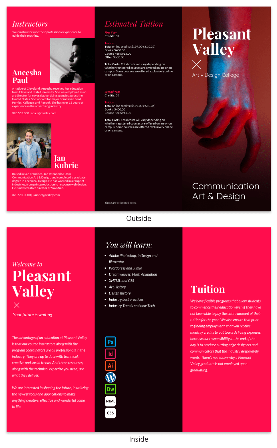
Venngage
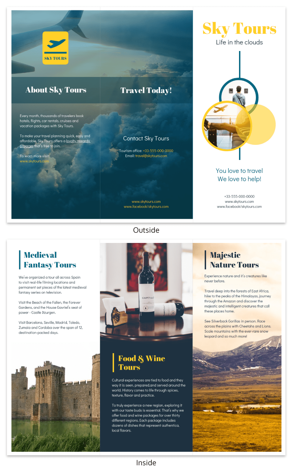
Venngage
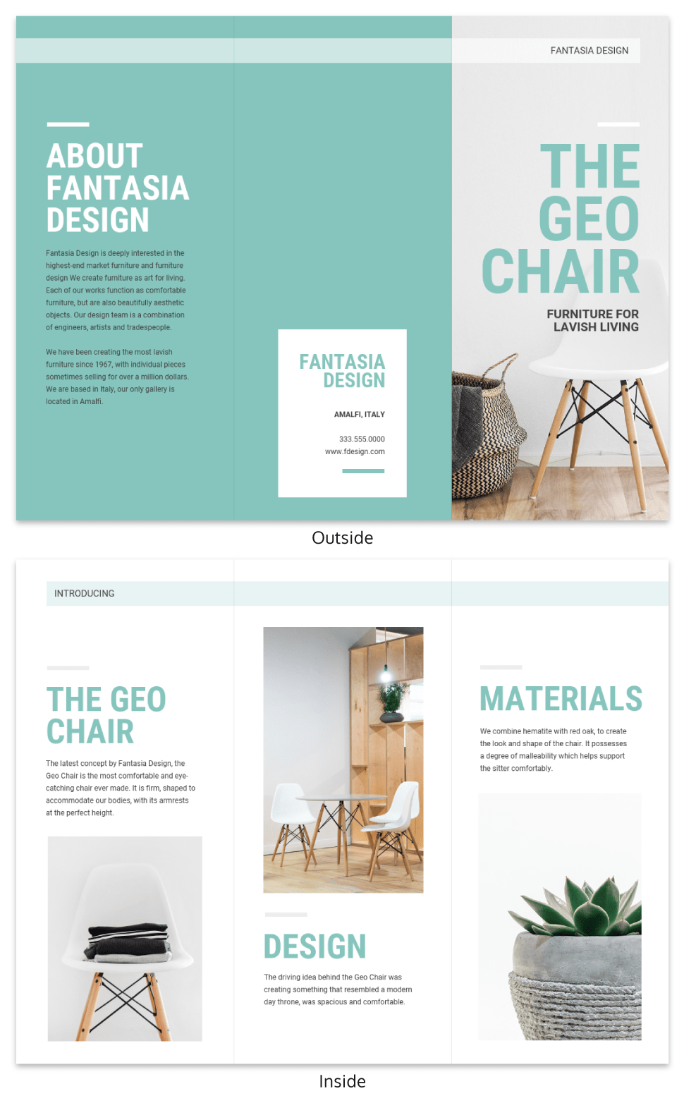
Venngage
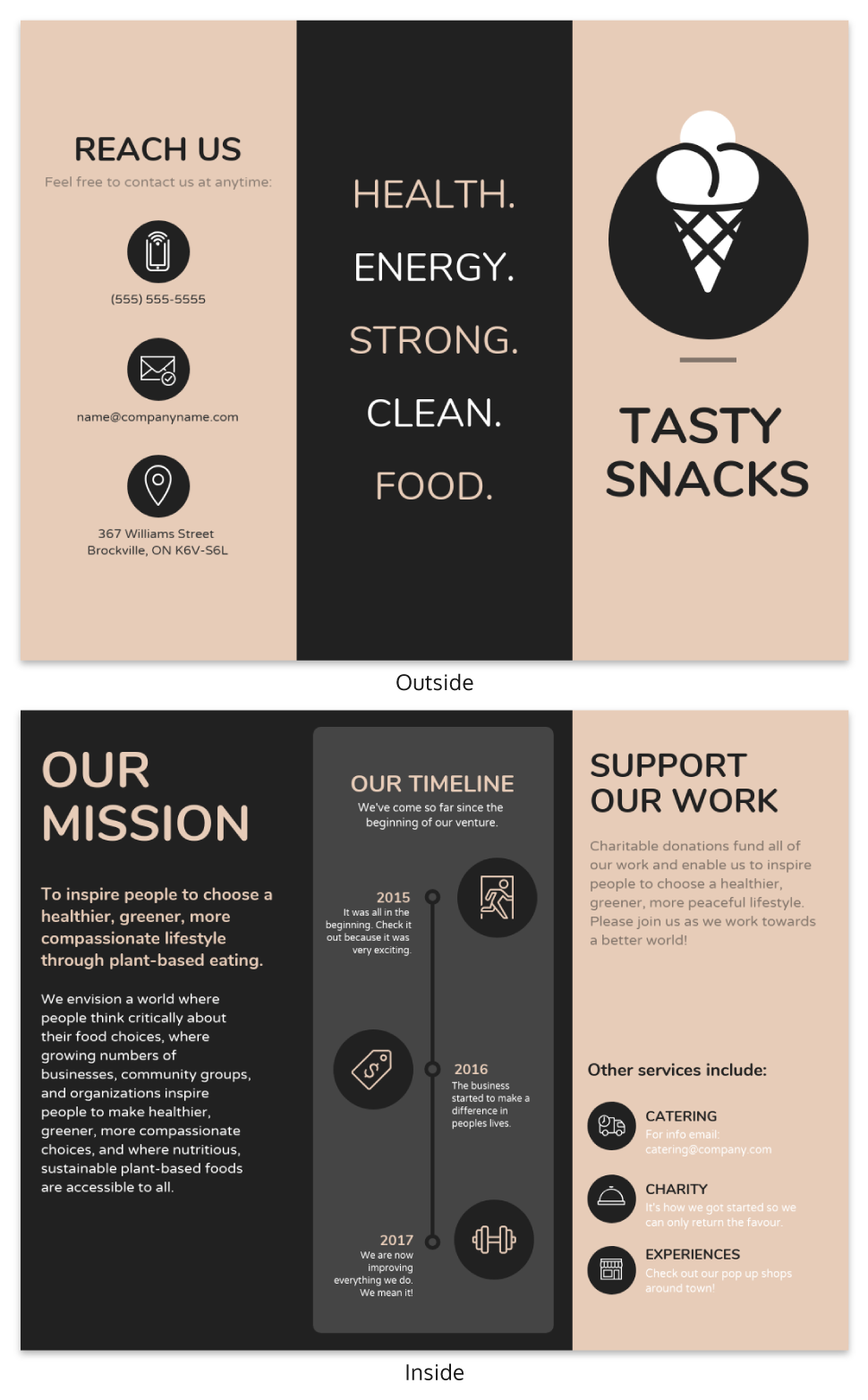
Venngage
If you’ve done your homework, then there’s a good chance you won’t fall for any of the common mistakes that people make when designing their own brochures. With this in mind, make sure to remember the details above and use Venngage when making one. What are you waiting for? Start making your brochure today! Click here.
